Simple Hand-Lettering Ideas for Beginners
Most people assume good lettering requires beautiful handwriting. It doesn’t. Hand-lettering is closer to drawing words than writing them, which means you can build the letters slowly, fix them, and refine them over time.
That shift in thinking takes a lot of pressure off. The below are all things you can try with a pencil and a scrap of paper, and none of them ask for fancy supplies or years of practice.
Start With Plain Block Letters
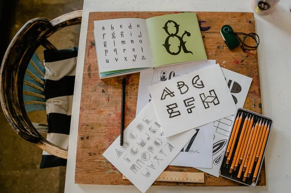
Block letters are the easiest way in. Draw each letter with straight lines and simple curves, keeping the height consistent. Light pencil guidelines at the top and bottom help a lot.
Once the shapes feel comfortable, try making them slightly wider or narrower. Even this small change gives your work a distinct look without any extra skill.
Try Faux Calligraphy
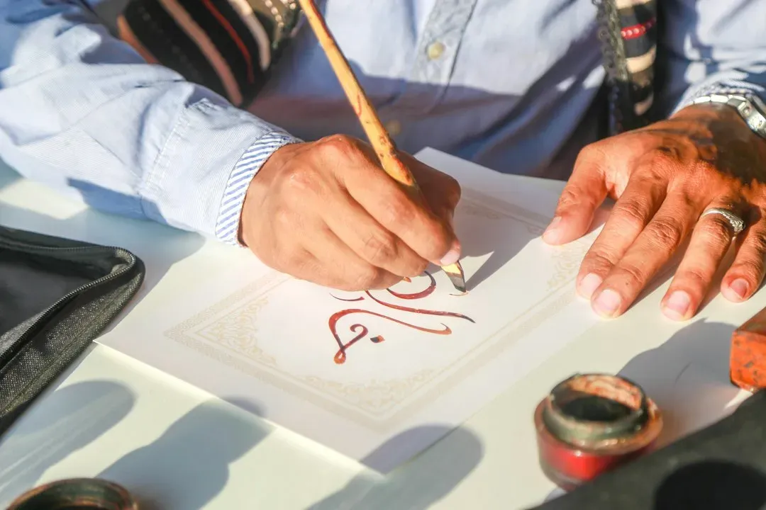
Faux calligraphy imitates the look of brush pen lettering using an ordinary pen or pencil. Write a word in your regular cursive or print, then thicken the downstrokes, which are the lines where your hand moves toward you. Fill in the gap between two parallel lines to create a bolder stroke.
It’s slow at first, though it’s forgiving. You’re building the letters, not racing through them, so there’s time to correct wobbly spots.
Add Simple Drop Shadows
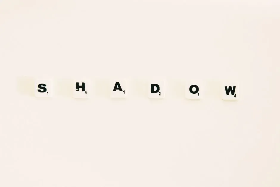
A drop shadow makes plain letters look dimensional. Pick one direction, say down and to the right, and add a short line along the same side of every letter stroke. Then connect the corners and fill the space in with a darker tone or hatching.
Consistency matters more than precision here. If every shadow falls the same way, the effect reads as deliberate even if the lines are a bit shaky.
Play With Monoline Script
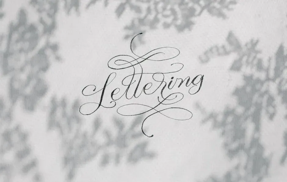
Monoline script uses a single line weight throughout, so there’s no need to worry about thick and thin strokes. Use a fineliner or a regular pen and write in a relaxed, slanted cursive. Connect the letters smoothly, and lift your pen when you need to.
This style works well for cards, journal headings, and labels. It also helps you get used to letter spacing and flow before you tackle more complicated techniques.
Mix Sizes and Styles in One Phrase
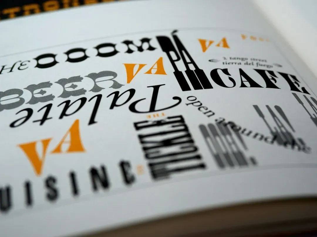
A short quote often looks better when different words get different treatment. Make one key word big and bold, then set the smaller words in a simple print or script around it. This creates a focal point and gives the layout some rhythm.
Try not to use more than two or three styles at once. Too many competing looks can make a page feel busy rather than designed.
Decorate With Small Flourishes and Doodles
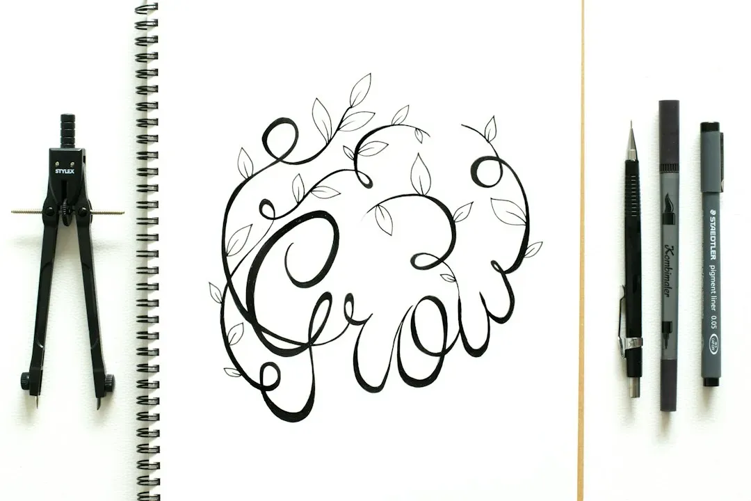
Little extras can lift a basic layout. Consider underlining with a curved swoosh, adding dots or stars, or drawing a tiny leaf branch beside the words. Simple borders, such as a line or a row of small dashes, also frame the text nicely.
Keep these touches modest. They should support the lettering, not compete with it.
Use Tracing and Practice Sheets
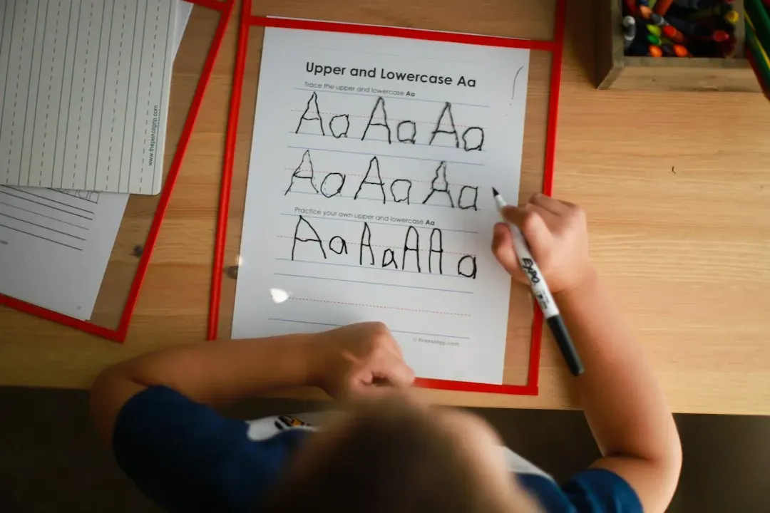
Tracing is a legitimate way to learn, not a cheat. Printable alphabets and worksheets let you feel how strokes are formed and where letters connect. Placing thin paper over a sample works too.
After a few rounds, try copying the same alphabet freehand and compare. You’ll quickly notice which letters need more attention, which is useful information.
Choose Beginner Friendly Tools
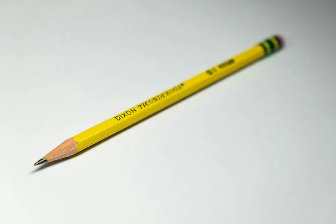
A sharpened pencil, an eraser, and a fineliner are enough to start. If you’d like to experiment further, a small brush pen is a common next step, though it takes more control than a regular pen. Smooth paper tends to be easier on pen tips than rough sheets.
Buying a lot of gear early rarely helps. It’s better to learn what you enjoy first and expand from there.
Build a Small Daily Habit

Ten minutes of practice often beats one long weekend session. Pick one letter, one word, or one style per day, and keep your pages so you can look back later. Progress in lettering tends to be gradual, and old pages make it easier to see.
Don’t throw away the awkward attempts. They show what you were working on and often teach more than the polished ones.
Final Thoughts
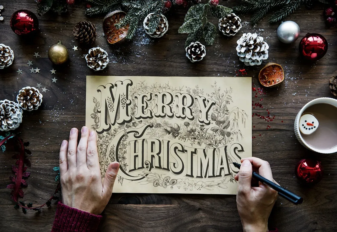
Hand-lettering rewards patience more than talent. Start with simple shapes, add one new technique at a time, and let your own style appear gradually. A crooked first attempt is just the beginning of a page that will look better next week.